Outputs
After the execution of all the stages has finished (scme, _ = mainstage.run()), the user has access to a variety of optimal Stream Cost Model Evaluations (SCMEs) produced by the genetic algortihm of Stream (i.e. Hall of fame). Each of these SCMEs offers a layer-core allocation with an unique trade-off due to the usage of a NSGA-II genetic algorithm.
Printing the attributs of a specific SCME
The user can select one of these SCMEs by using selecting a specific SCME with the command scme = scme[0]. Another SCME can be selected by using a different index than 0.
After selecting a SCME with the previous command, the attributes of the SCME can be printed to the terminal with the following instructions:
from pprint import pprint
pprint(vars(scme))
After a specific SCME is selected, the user can generate a variety of outputs which will be introduced in the following. If you are using the example provided in this file, then all the introduced outputs are saved in the outputs folder in your repo.
Pickle file of SCME
By using the save_scme() function from stream.utils, the user can save a specific SCME in a pickle file for later investigations. The SCME includes all attributes of the StreamCostModelEvaluation in the cost_model.py file. Examples for these attributes are the latency or the maximal memory usage of layer-core allocation underling to the SCME.
Schedule visualization
Plotly visualization
The schedule of a specific SCME can be saved in a Plotly-html file by calling visualize_timeline_plotly() from stream.visualization.schedule. The saved file can be opened in a web browser and the different parts of the schedule can be further investigated. The following image shows an example of this visualization:
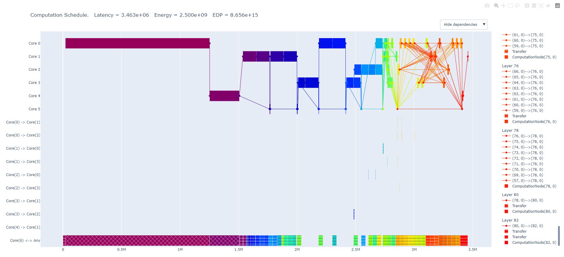
The first six lines of the diagram (Core 0 to Core 5) show the usage of the different cores for this specific SCME. The following nine lines (Core(0) -> Core(1) to Core(4) -> Core(1)) show the communication (i.e. data exchange) between the different processing cores. The last line of the diagram (Core(6) <-> Any) shows the utilization of the port to the off-chip memory (i.e. Core(6)).
An example of such an interactive Plotly visualization can be accessed through this link.
PNG visualization
By using the plot_timeline_brokenaxes() function from stream.visualization.schedule, a similar visualization than the Plotly schedule can be saved in a png file.
Memory usage visualization
The function plot_memory_usage() from stream.visualization.memory_usage allows to save a visualization of the memory usage of a specific SCME in a png file. An example can look like the following diagram:
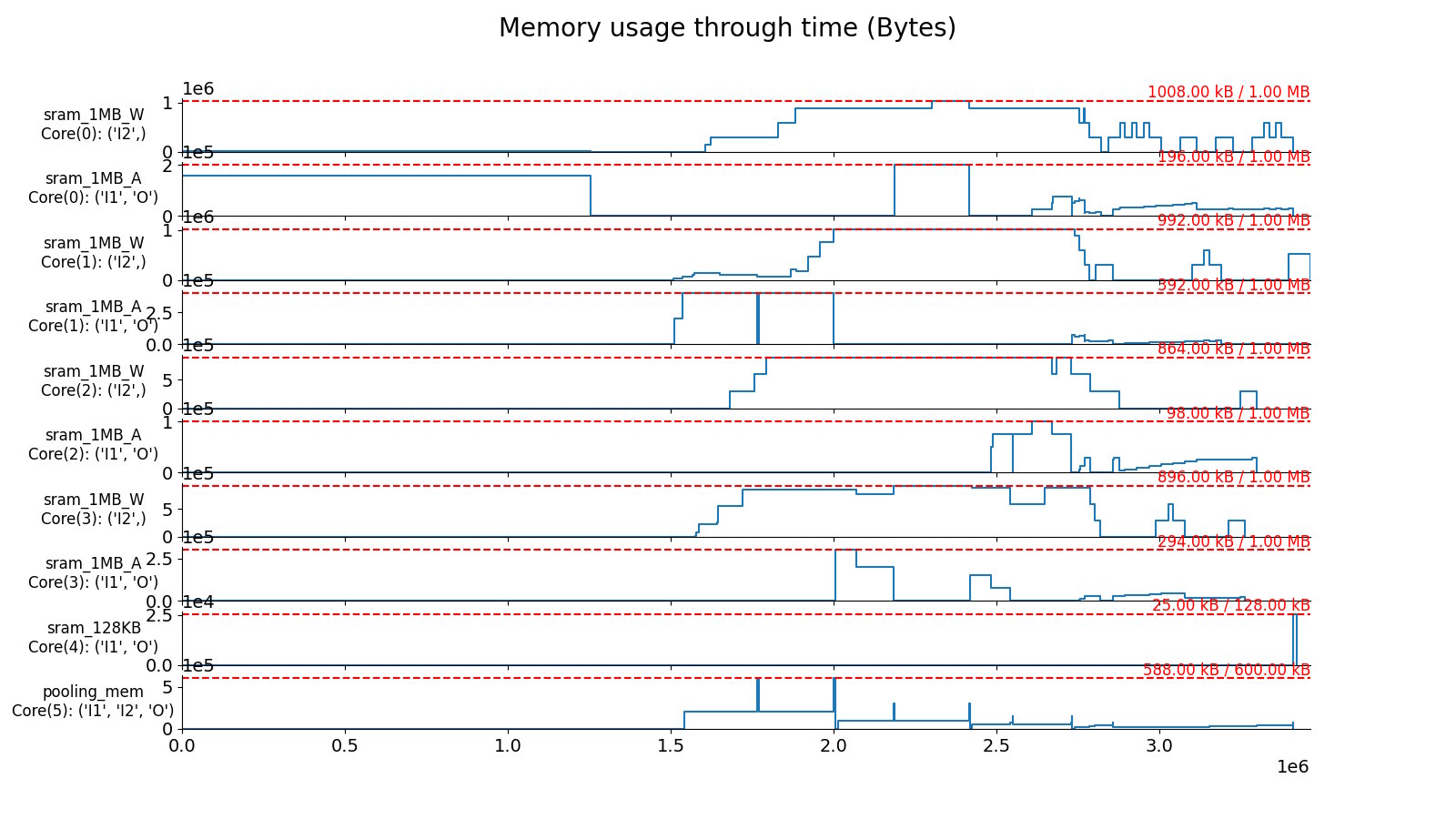
The diagram shows the utilization of the on-chip SRAM memories of the different cores in the hardware architecture for a specific SCME. In this example each core of core 0 to core 3 has two SRAM memories. One of the two SRAM memories (e.g. sram_1MB_W) holds the weights for the processing in the core. The other SRAM memory of each core (e.g. sram_1MB_A) holds the activations (i.e. input and output activations) of the compuations in the core. In this example, core 4 and core 5 have only one memory to store all relevant data. The plots for each of these memories show how much they are utilized during the processing of the workload.